Consistent and personality-driven typography is the basis of effective brand standards. The HCU brand is made up of select typefaces, each with its own specified use in print and web-based materials. These typefaces should be used in all HCU materials without substitution. Each typeface is available at a variety of weights, offering flexibility for a wide range of applications.
Heading Font
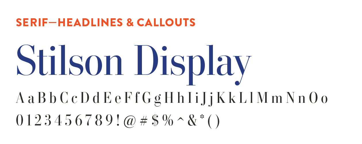
Strong, yet refined, Stilson Display is a serif typeface that highlights HCU’s confidence and compassion. It should be used at a large scale for headlines only, never for body copy.
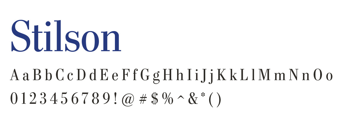
When using Stilson for callouts or longer sentences, this text version of the font is available for increased legibility. It should not be used for body copy.
Subheading Font
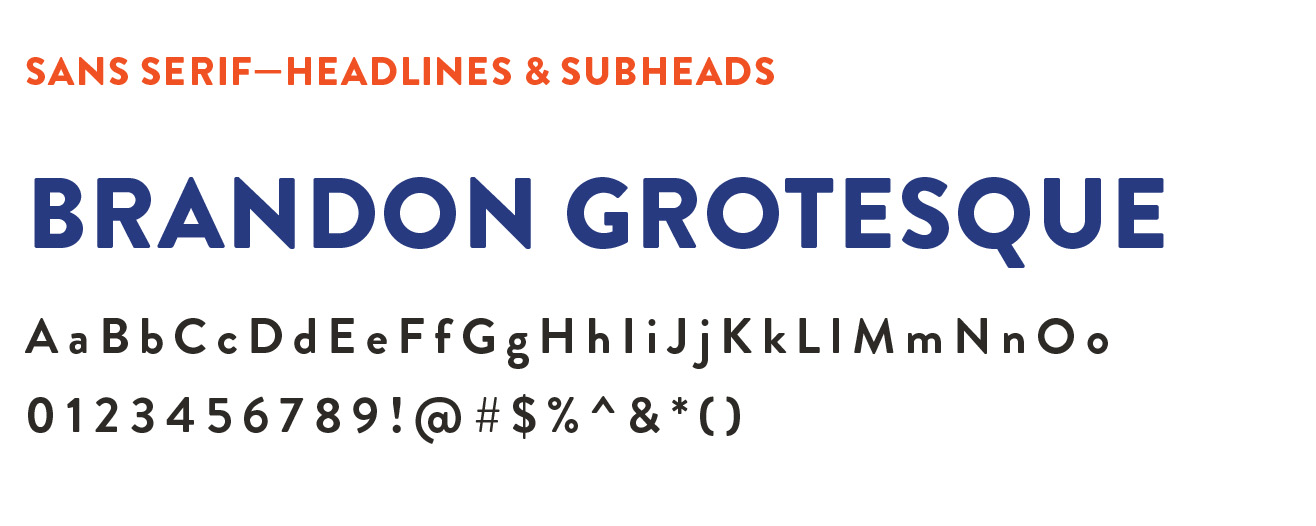
HCU’s sans-serif typeface, Brandon Grotesque is influenced by geometric-style sans serif faces. This typeface comes in a multitude of different weights that give it multi-functional uses for subheadings and captions. It is most effective when used in all caps.
Body Font
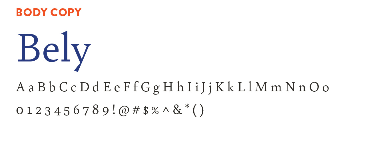
Bely is HCU’s other available serif typeface. Bely is a text font family built upon classical proportions to capitalize on reading familiarity. Bely is to be used for body copy only.
All three font families are available with an Adobe Creative Cloud account, which HCU makes available for all full-time faculty and staff through an enterprise license. Request installation of Creative Cloud at hc.edu/helpdesk. These fonts can also be purchased and downloaded individually from various font purchasing websites. Please reach out to Marketing by emailing HCUmarketing@HC.edu for help using these fonts appropriately. Use the button below to view a helpful guide to downloading the fonts.