


When Houston Baptist College opened its doors in 1963, the freshman class numbered 193 students housed in a cluster of new buildings with a teaching staff of 30 faculty. The surrounding Sharpstown neighborhood adjacent to the barren campus was in the fledgling stage of development – as Houston’s first master-planned community, it was a remote and lonely place compared to today.
Over the next decade, the campus and the nearby area expanded, and in 1973, Houston Baptist College officially became Houston Baptist University following completion of a formal self-study for the Southern Association of Colleges and Schools, and approval by the Board of Trustees in November 1972. This new name “stuck” for the next 50 years.

But, once again, the winds of change began to blow. An extraordinary transition at the University began with a single spark – the decision to rename, rebrand and craft a new logo that would become the symbol of the future. For 16 years, the then-named Houston Baptist University engaged in a prayerful review process to consider this significant alteration – the reimagining of its very name. Deeply rooted in faith, the University sought guidance and discernment throughout this proposed transformation. On May 17, 2022, the Board of Trustees embraced the positive impact a name change could have on the institution’s future. With conviction and divine guidance, the Board officially approved the switch to Houston Christian University, marking a pivotal moment in HCU’s history.
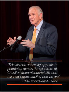
On September 21, 2022, the new name, Houston Christian University, was unveiled in an open forum with faculty, staff, alumni, past and present trustees, and students. This change symbolized the culmination of prayer and unwavering dedication to the University’s mission and values. President Robert B. Sloan spoke during the forum. “We are committed to being a distinctively Christian university that welcomes all Christians to benefit from our excellent academic programs. This historic university appeals to people all across the spectrum of Christian denominational life, and this new name clarifies who we are,” said Dr. Sloan.
Aided by the esteemed higher education marketing firm, Carnegie LLP, and armed with a new name, HCU set out to discover a fresh identity that, not only defined its academic and spiritual image, but also revitalized its athletics program. The goal: create new logos that would capture HCU’s core values, modernize its visual identity and reflect its commitment to excellence in education, as well as athletics.
As the name change set the stage for a transformative narrative, HCU turned its attention to the visual representation that would personify this new identity. With an understanding of the significance of a compelling visual representation, the University, led by Dr. Sloan, embarked on the mission to reimagine the logo.
![]()
The design odyssey began with many brainstorming sessions and collaborative meetings where HCU stakeholders across multiple departments gathered to share their ideas. These sessions proved to be invaluable as the collective creativity and expertise of the HCU team illuminated the path, guiding the design process with purpose and resolve. Fueled by the shared excitement, HCU’s Executive Council played a pivotal role in shaping this growing narrative. Their input was an essential ingredient in the ever-changing landscape of design possibilities.
The selection of iconic campus symbols became an integral part of the University’s reimagined identity. The vision provided by HCU’s Executive Council ensured that the developing logo would be a testament to HCU’s values and aspirations: a symbol of the university’s unwavering commitment to academic excellence, spiritual growth and community engagement. Preliminary logo designs emerged, each a brushstroke canvas of possibility. The designs were carefully crafted to resonate with HCU’s diverse stakeholders including students, staff, faculty and alumni. Once the initial logo versions were created, a sampling process was initiated within the HCU community. Employees from various departments were invited to provide feedback and preferences. This initial survey allowed HCU to gauge reactions and perspectives from its own team, ensuring that their voices were heard in shaping the new brand. But this tale of artistic exploration did not stop within the walls of HCU. The next chapter unfolded when the logo finalists faced the scrutiny of external eyes. The showcase revealed four logo designs.

Through focus groups and sampling, the broader community joined in this narrative and cast their votes from which a clear winner appeared. The culmination of this collaborative process led to the selection of the logo design that most represents Houston Christian University’s identity. Our new logo features Belin Tower with a custom font specifically designed for us. The dynamic colors and unique typography convey a vibrancy and forward-thinking that aligns with HCU’s vision for the future. Dr. Sloan expressed his gratitude to both the internal and external stakeholders for their invaluable contribution to the logo redesign journey. On May 8, 2023, after many months of work, the new logo was unveiled to an enthusiastic response at the faculty and staff End-of-Year Celebration.
The rebrand will be implemented across multiple platforms including the University’s website, official communications, email signatures, marketing materials, advertising and on-campus signage. An equally important part of this redesign process included a revamp of the athletics brand. Our famed Husky head received a facelift, its features subtly refined to reflect the new-found energy and dynamism pouring through HCU. With a bold color palette, the revised logo exemplifies the very essence of our beloved Huskies. The collaborative efforts amongst the University stakeholders, combined with Carnegie, have resulted in logo designs which embody our spirit of academic excellence.

HCU stands poised to embrace a future teeming with possibilities. The revitalized Athletics identity, complete with the enchanting Husky head, will rally students, faculty, staff, alumni and fans alike, igniting a sense of pride and unity. As HCU sets its sights on the ambitious goal of accommodating 10,000 students, these redesigns serve as a powerful testament to the University’s commitment to academics, spiritual growth and vibrant community. With each passing day, Houston Christian University will serve as a beacon to guide students towards a transformative journey. A new dawn awaits. Let the journey continue.
To see all of the new university brand standards, go to HC.edu/marketing.